Why A/B Testing Matters for Telehealth
In telehealth, small conversion improvements add up fast. A landing page converting at 5% instead of 3% means ~67% more patients from the same ad spend. Yet many clinics and brands still rely on opinions instead of running structured experiments.
This guide covers what to test on your landing pages and intake flows—so you can stop guessing and start optimizing.
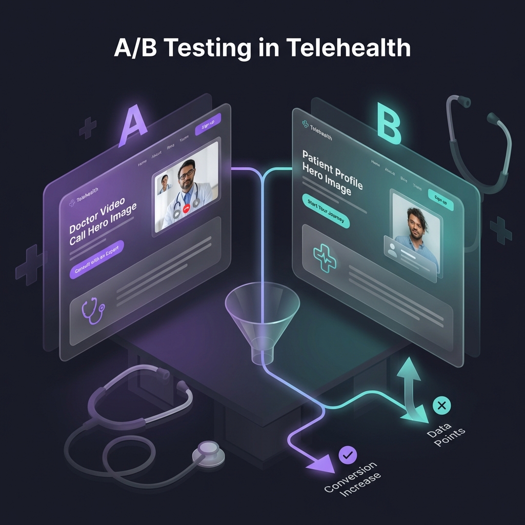
 A/B testing concept for telehealth websites
Landing Page Elements to Test
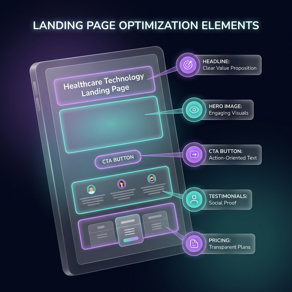
 Key landing page elements to optimize
1. Headlines and Value Propositions
Your headline sets expectations in the first few seconds. Even small changes can lift click-through and form starts.
Test Ideas:
| Version A | Version B |
|---|---|
| "Online Weight Loss Treatment" | "Prescription Weight Loss Programs Online" |
| "Telehealth Made Simple" | "Talk to a Licensed Provider—From Home" |
| "Get Started Today" | "Check Eligibility in 2 Minutes" |
What to measure:
- Bounce rate
- Scroll depth
- Click-through to intake
2. Hero Section Layout
The hero section is your biggest “trust + clarity” zone above the fold.
Test Ideas:
- Image vs. video: Does a short provider intro outperform a static image?
- Patient photos vs. provider photos: Which builds more confidence?
- Before/after imagery: Sometimes it helps, sometimes it hurts trust (test carefully)
- Text-first hero: A clean hero with no image can outperform busy layouts
3. Call-to-Action (CTA) Buttons
CTAs are often the highest-leverage thing to test because they control the next step.
Button text tests:
- "Get Started" vs. "Start My Consultation"
- "Book Now" vs. "Check My Eligibility"
- "See If I Qualify" vs. "Begin Assessment"
Button design tests:
- Contrast vs. background
- Size (large vs. standard)
- Position (above fold, sticky, repeated CTAs)
- Micro-urgency (avoid hype; test subtle wording like “Limited availability”)
4. Social Proof Placement
Trust signals can make or break telehealth conversion.
Test Ideas:
- Review summary: “4.8★ average rating” vs. a full review widget
- Licensing clarity: “Licensed providers in your state” near the CTA
- Media logos: “As seen in” blocks (only if legitimate)
- Testimonials: Video vs. text, named vs. anonymous (privacy-friendly)
Tip: Avoid compliance badges that imply certification unless you can back them up. Use accurate trust language like “secure messaging” or “privacy-focused workflows” instead.
5. Pricing Presentation
Pricing affects both conversion and lead quality.
Test Ideas:
- Show price upfront vs. after eligibility check
- Monthly price vs. per-visit price
- “Starting at” vs. exact price
- Clear “what’s included” breakdown vs. one-line price
- Insurance messaging (generic “insurance may be used” vs. detailed plans)
6. Form Placement and Length
The transition from landing page → intake is where many funnels drop.
Test Ideas:
- Embedded form vs. separate intake page
- Single-step vs. multi-step wizard
- Number of fields shown initially
- Progress indicator (Step 1 of 5)
- Reassurance copy (“Takes ~2 minutes”)
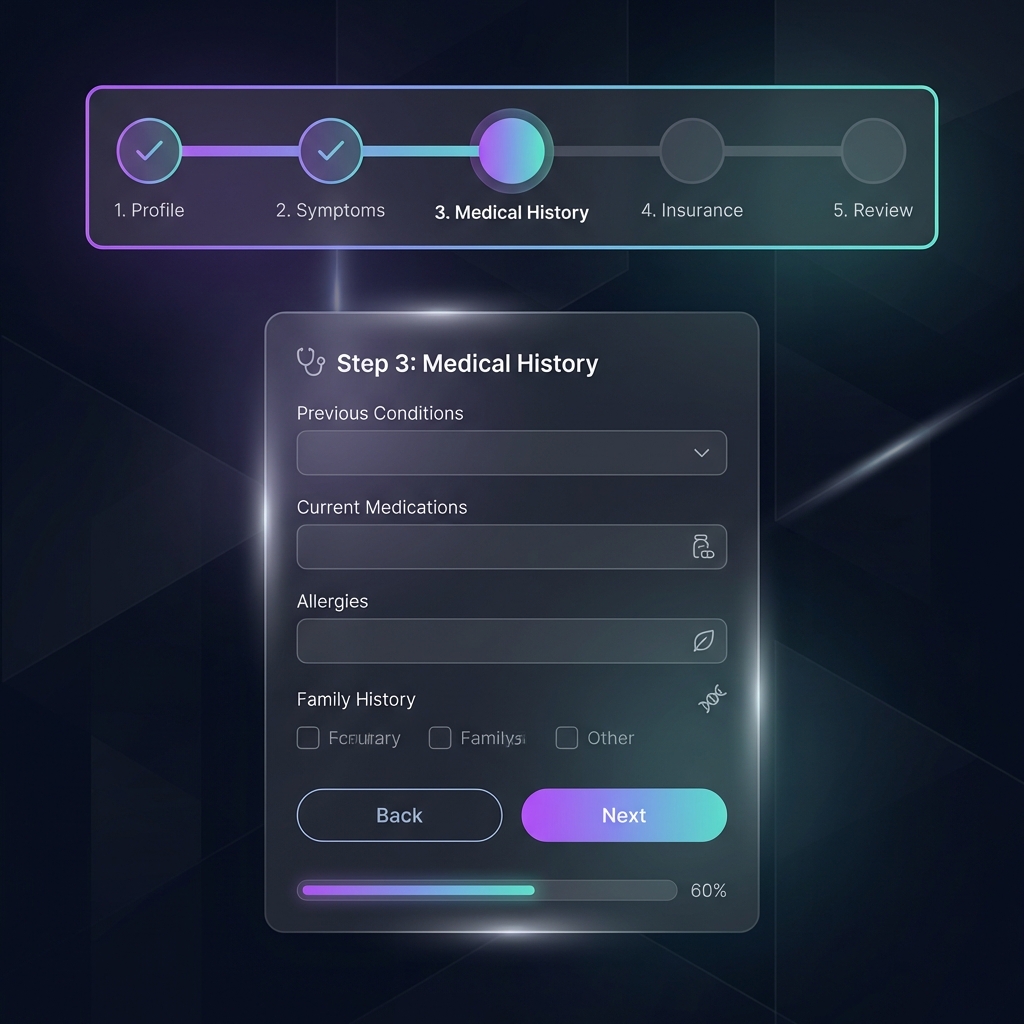
 Multi-step intake form flow
Intake Flow Optimization
1. First Question Strategy
Your first question sets momentum and confidence.
Test Ideas:
- Easy start: “What are you looking to improve?”
- Qualification first: “What state are you in?” (routing and rules)
- Outcome-oriented: “What result are you aiming for?”
- Logistics first: “Have you used telehealth before?”
2. Question Order and Grouping
Order affects completion more than most people expect.
Test Ideas:
- Group by topic vs. progressive disclosure
- Sensitive questions early vs. later (usually later wins)
- Required fields first vs. spread out
- Conditional questions (show only what’s relevant)
3. Progress Indicators
People complete more when they know what’s left.
Test Ideas:
- Progress bar vs. step count
- Time estimate (“~2 minutes left”)
- No progress indicator for short forms
4. Field Types and Input Methods
Input friction matters, especially on mobile.
Test Ideas:
- Dropdown vs. radio buttons
- Checkboxes vs. multi-select dropdown
- Structured inputs vs. free text
- Date picker vs. text
- Slider vs. number input for weight/height
5. Mobile Optimization
Most telehealth traffic is mobile. Don’t treat it as a “responsive afterthought.”
Test Ideas:
- Single column layouts
- Larger tap targets
- Correct keyboard types (numeric for phone/ZIP)
- Auto-advance where it helps
- Sticky “Continue” button
6. Error Handling and Validation
Bad error UX kills completion.
Test Ideas:
- Inline validation vs. validate on submit
- Friendly error tone vs. clinical tone
- Highlight missing fields clearly
- Autosave + “Continue later” messaging
High-Impact Test Ideas
Landing Page Tests
| Element | Hypothesis | Expected Impact |
|---|---|---|
| Add video testimonial | Increases trust and clarity | +5–15% CTR |
| Show pricing upfront | Fewer unqualified leads, may reduce volume | ±5–15% conversion |
| Remove navigation | Fewer distractions → more form starts | +5–15% conversion |
| Add chat entry point | Answers questions quickly | +5–20% conversion |
| Improve mobile hero | Better clarity above the fold | +5–20% form starts |
Intake Flow Tests
| Element | Hypothesis | Expected Impact |
|---|---|---|
| Reduce fields by 30% | Lower friction increases completion | +10–25% completion |
| Add “save & continue later” | Recovers partial leads | +3–10% total conversion |
| Add gentle reassurance copy | Reduces anxiety on sensitive questions | +2–8% completion |
| Smart defaults | Less effort, fewer mistakes | +3–10% completion |
| Better error UX | Fewer drop-offs after validation | +3–12% completion |
These ranges depend on traffic source, offer, and program type. Use them as direction—not guarantees.
A/B Testing Best Practices
Statistical Significance
Avoid calling winners too early:
- Minimum sample size: Aim for at least 100 conversions per variant (more is better)
- Duration: Run for 7+ days to include day-of-week effects
- Confidence: Target 95%+ confidence before shipping
- One variable at a time: Keep tests focused so you know what caused the lift
Avoiding Common Mistakes
Don’t:
- Stop a test on the first “good day”
- Run tests during unusual traffic events (holidays, PR spikes)
- Ignore mobile vs. desktop differences
- Optimize only for clicks (track downstream conversion quality)
Do:
- Document every test with a hypothesis and expected outcome
- Track the full funnel, not just the tested step
- Start with big changes, then iterate on details
- Segment results by channel and device
Testing Tools
Popular options for telehealth experimentation include:
- Optimizely: Enterprise experimentation + feature testing
- VWO: Strong testing suite and UX tooling
- AB Tasty: Testing + personalization
- Convert: Lightweight and privacy-conscious
- Statsig / LaunchDarkly: Great for product + feature experiments
Note: Google Optimize has been discontinued, so plan on using an alternative.
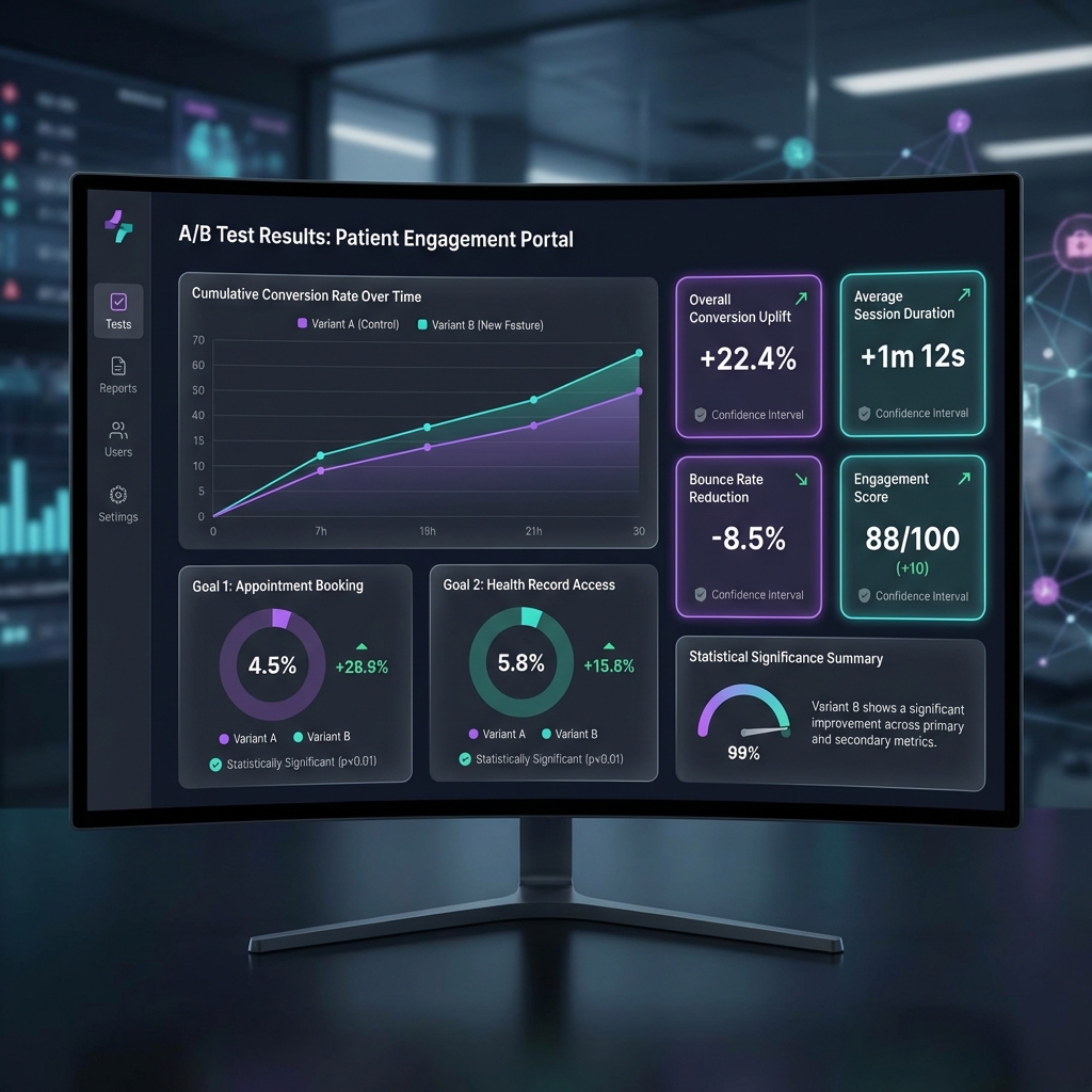
 A/B testing metrics dashboard
Measuring Success Beyond Conversion Rate
Primary Metrics
- Form start rate: % of visitors who begin the intake
- Form completion rate: % who finish the intake
- Booking rate: % who schedule the first visit (if applicable)
- Show rate: % who attend
Secondary Metrics
- Time to complete: Faster isn’t always better (it may signal confusion)
- Drop-off points: Where do people leave?
- Return rate: Do patients come back to finish?
- Lead quality: Are completed intakes actually a good fit?
Long-Term Metrics
The best winner isn’t always the one with the highest immediate conversion:
- Patient LTV: Some pages attract higher-value patients
- Retention: Some funnels convert fast but churn quickly
- Refund rate: High conversion may increase chargebacks/refunds if expectations are unclear
- Referrals: Better experience drives word of mouth
Building a Testing Culture
Create a Test Backlog
Maintain a prioritized list of test ideas:
- Rank by potential impact (high/medium/low)
- Estimate implementation effort
- Prioritize high-impact, low-effort tests
- Review results weekly and plan the next test
Document Everything
For each test, record:
- Hypothesis and rationale
- Variants tested
- Traffic allocation
- Start and end dates
- Results and statistical significance
- Decision and next steps
Iterate Continuously
A/B testing is never “done”:
- Winners become the new baseline
- Test the next hypothesis
- Revisit old ideas when traffic patterns change
- Share learnings across growth + ops + clinical teams
Getting Started: Your First 5 Tests
If you’ve never run A/B tests, start here:
- CTA button text: Improve clarity of the next step
- Form length: Remove 2–3 non-essential fields
- Social proof: Add testimonials or reposition them
- Mobile hero: Improve above-the-fold clarity on phones
- Progress indicator: Make the intake feel manageable
These tests are low-risk, fast to implement, and often produce measurable results.
Conclusion
A/B testing is one of the highest-ROI activities for telehealth growth. By systematically improving landing pages and intake flows, you can increase patient acquisition without increasing ad spend.
Start with high-impact, low-effort tests. Let data—not opinions—drive decisions.
Ready to optimize your patient acquisition? Explore our telehealth platform or contact us to learn how we can help you convert more patients.